Last year, I read From Vietnam to America by Gail Paradise Kelly. Written in 1977, the book chronicles the experiences of Vietnamese refugees in the US after the Fall of Saigon in April 1975. That year, most Vietnamese refugees traveled through Guam or Wake on their way to one of four refugee camps in the US: Fort Indiantown Gap in Pennsylvania, Fort Chaffee in Arkansas, Camp Pendleton in California, or Eglin Air Force Base in the Florida panhandle.
My dad arrived at Fort Indiantown Gap in 1975 (about 100 miles from my current home in Philadelphia) before moving to Maine with his sponsor. While Dr. Kelly goes in-depth about the failures of the US government to prepare for so many refugees, I’m going to start by taking a spatial look at refugee movement. I’ll follow up in the future with more.
Show code
girafe(ggobj = p,
options = list(
opts_tooltip(
css = "padding:3pt;font-family: Open Sans;color:white;background-color:black;")),
width_svg = 9.9, height_svg = 7.9)
Cities in California saw much of the resettlement, likely influenced by proximity to Camp Pendleton. A few other places that stand out on the map above are east coast cities like New York, Philly, and DC, where the numbers are relatively low, and Jacksonville, where the resettlement numbers are relatively high.
According to Dr. Kelly, the lower numbers in the northeast can be explained by economic recession in the 70s; these cities were hit hard, and higher unemployment made these destinations less attractive for resettlement.
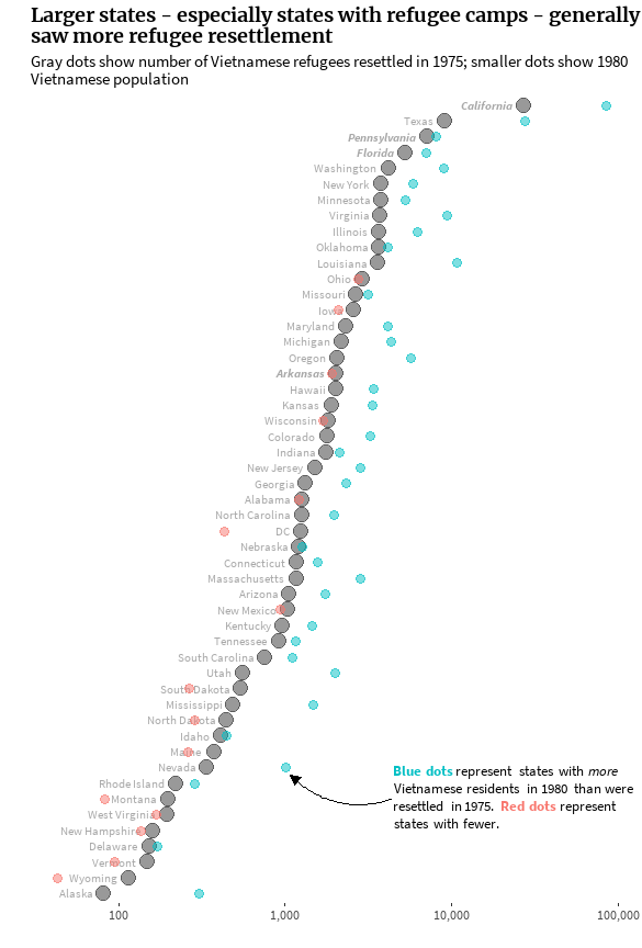
The states that saw the most resettlement (in terms of raw numbers) were generally larger states and states with refugee camps (or in close proximity to refugee camps). California outranks most other states by orders of magnitude (so much that I had to add a log scale to the graph below).
Show code
census_80 <- read_csv('../../../vietnam/census_vietnamese_1980.csv') %>%
rename(n_1980 = vietnamese_population)
resettlement_states <- resettlement_states %>%
left_join(census_80, by = 'state') %>%
mutate(refugee_camp = state %in% c('California', 'Pennsylvania', 'Arkansas', 'Florida'),
compare_80_resettled = ifelse((n_1980 - n_resettled) > 0, 'increase', 'decrease'),
prop_80_resettled = n_1980/n_resettled)
label_df <- tibble(
label = "<span style='color:#00BFC4'>**Blue dots**</span> represent states with <i>more</i><br>Vietnamese residents in 1980 than were<br>resettled in 1975. <span style='color:#F8766D'>**Red dots**</span> represent<br>states with fewer.",
x = 4500, y = 7
)
resettlement_states %>%
ggplot(aes(y = reorder(state, n_resettled))) +
geom_point(aes(x = n_resettled), size = 4.5, alpha = 0.4) +
geom_text(aes(x = 0.85*n_resettled, label = state, fontface = ifelse(refugee_camp, 4, 1)),
hjust = 1, vjust = 0.5, col = 'darkgray', size = 3, family = 'ssp') +
geom_point(aes(x = n_1980, col = compare_80_resettled), size = 3, alpha = 0.5) +
geom_richtext(data = label_df,
aes(x = x, y = y, label = label),
hjust = 0, size = 3.5, family = 'ssp',
fill = NA, label.color = NA, label.padding = grid::unit(rep(0, 4), 'pt')) +
annotate(geom = 'curve', x = 4400, y = 7, xend = 1080, yend = 8.5,
curvature = -0.3, arrow = arrow(type = 'closed', length = unit(0.1, 'in'))) +
scale_x_continuous(trans = 'log10', breaks = c(100, 1000, 10000, 100000),
labels = c('100', '1,000', '10,000', '100,000')) +
labs(title = 'Larger states - especially states with refugee camps - generally\nsaw more refugee resettlement',
subtitle = 'Gray dots show number of Vietnamese refugees resettled in 1975; smaller dots show 1980\nVietnamese population',
x = '', y = '') +
font_theme +
theme(legend.position = 'none',
panel.background = element_blank(),
panel.grid = element_blank(),
axis.text.y = element_blank(),
axis.ticks.y = element_blank())

I tried to find census data from before and after the Fall of Saigon in 1975, but it doesn’t look like the 1970 decennial census accounted for the number of Vietnamese residents per state. The smaller red and blue dots in the graph above represent the Vietnamese population as of 1980. In the five years after the refugee camps closed, it seems that the states with the largest Vietnamese populations gained more people, while the states with the fewest Vietnamese residents tended to see shrinkage.
From these graphs alone, it appears my dad’s situation wasn’t exactly typical. While many refugees moved to urban centers, his sponsor brought him (and others) to Maine, a state where only 375 refugee resettlements were recorded.