As far as large US cities go, I’ve spent a substantial chunk of time in (or near) two: Philadelphia and Seattle. These two places are different in…almost every way I can think of. One thing I notice in Philadelphia is that tons of people are from Philly (or the surrounding suburbs). That wasn’t at all true in Seattle, where it seemed like most the people I met were transplants like me.
I decided to take a quick look at some census data to see if my experience is reflected in the data, or if I was just imagining things.
(Before I begin, a quick note: As a transplant myself, I’m not using the word “transplant” in a derogatory way. Changing demographics of cities can be difficult for many, and the negative aspects of those changes often fall on lower-income groups and communities of color. But instead of demonizing individuals who choose to move to a different city, I think it’s important to focus on action/inaction by policymakers who have power to make encourage demographic change without displacement.)
So, was my hunch completely imagined? Was I just meeting different people in Seattle than I’ve met in Philly? The graph below shows a smattering of large US cities, including Philly and Seattle. The horizontal axis represents median household income in each city, and the vertical axis represents what proportion of residents of each city were born in the state where the city is.
Show code
library(tidyverse); library(tidycensus); library(sf); library(ggrepel); library(showtext); library(patchwork)


census_api_key(Sys.getenv('census_api'))

source('../../../philly_analyses/race_ethnicity/race_ethnicity.R')
source('../../../philly_analyses/tools/side_by_side.R')

#########################################################################
# Set up fonts

font_add_google('Merriweather')
font_add_google('Source Sans Pro', 'ssp')

showtext_auto()

font_theme <- theme(
  plot.title = element_text(family = 'Merriweather', face = 'bold'),
  plot.subtitle = element_text(family = 'ssp'),
  axis.text = element_text(family = 'ssp'),
  axis.title = element_text(family = 'ssp'),
  legend.text = element_text(family = 'ssp'),
  plot.caption = element_text(family = 'ssp', color = 'darkgray')
)
#########################################################################


peer_cities <- 'baltimore city, maryland|philadelphia city, pennsylvania|seattle city, washington|new york city|chicago city, illinois|
                |los angeles city, california|phoenix city, arizona|boston city, massachusetts|minneapolis city, minnesota|
                |charlotte city, north carolina|denver city, colorado|portland city, oregon|
                |san francisco city, california|houston city, texas|austin city, texas|atlanta city, georgia|detroit city, michigan|
                |cleveland city, ohio|dallas city, texas|new orleans city, louisiana|indianapolis city, indiana'

peer_census_data <- get_acs(geography = 'place',
                            variables = c('B05002_001', 'B05002_003',
                                          'B06012_001', 'B06012_002', 'B19013_001',
                                          'B02001_001', 'B02001_003'),
                            year = 2018) %>%
  filter(grepl(peer_cities, NAME, ignore.case = TRUE),
         # Get rid of directional "places"
         ! grepl('east|west|south|north chicago|lake dallas', NAME, ignore.case = TRUE)) %>%
  group_by(NAME) %>%
  summarise(p_born_in_state = sum(estimate[variable == 'B05002_003'])/sum(estimate[variable == 'B05002_001']),
            p_poverty = sum(estimate[variable == 'B06012_002'])/sum(estimate[variable == 'B06012_001']),
            p_black = sum(estimate[variable == 'B02001_003'])/sum(estimate[variable == 'B02001_001']),
            med_income = median(estimate[variable == 'B19013_001'])) %>%
  mutate(NAME = gsub(' city', '', NAME))

peer_census_data %>%
  # remove state names from city labels
  mutate(NAME = gsub("(.*),.*", "\\1", NAME)) %>%
  ggplot(aes(x = med_income, y = p_born_in_state)) +
  geom_point(aes(color = p_black), size = 3.5) +
  geom_text_repel(aes(label = NAME), size = 3, fontface = 'italic', family = 'ssp') +
  annotate('text', x = 70000, y = 0.7,
           label = 'Almost 70% of Philadelphians\nwere born in PA, and Philly has\na higher poverty rate than\nmost large cities',
           size = 3.5, family = 'ssp') +
  geom_curve(aes(x = 60000, y = 0.72, xend = 44000, yend = 0.67), curvature = 0.3,
             arrow = arrow(type = 'closed', length = unit(0.1, 'in'))) +
  annotate('text', x = 95000, y = 0.5,
           label = 'Seattle and SF have higher\nmedian incomes, more transplants,\nand fewer Black residents\nthan most other cities',
           size = 3.5, family = 'ssp') +
  geom_curve(aes(x = 94000, y = 0.46, xend = 85562, yend = 0.375), curvature = 0.2,
             arrow = arrow(type = 'closed', length = unit(0.1, 'in'))) +
  geom_curve(aes(x = 96000, y = 0.46, xend = 104552, yend = 0.405), curvature = -0.2,
             arrow = arrow(type = 'closed', length = unit(0.1, 'in'))) +
  scale_y_continuous(labels = scales::percent_format(accuracy = 1)) +
  scale_x_continuous(labels = scales::dollar) +
  labs(title = 'Cities with lower median incomes tend to have fewer out-of-state transplants',
       subtitle = 'Darker purples represent cities with higher proportions of Black residents',
       x = 'Median Household Income',
       y = '% of Residents Born in State') +
  font_theme +
  theme(panel.grid = element_blank(),
        legend.position = 'none',
        panel.background = element_rect(fill = '#F6F6F7'),
        axis.title.y = element_text(margin = margin(t = 0, r = 10, b = 0, l = 0)),
        axis.title.x = element_text(margin = margin(t = 10, r = 0, b = 0, l = 0))) +
  scale_color_gradient(low = '#F3E39B', high = '#8A1BD2')
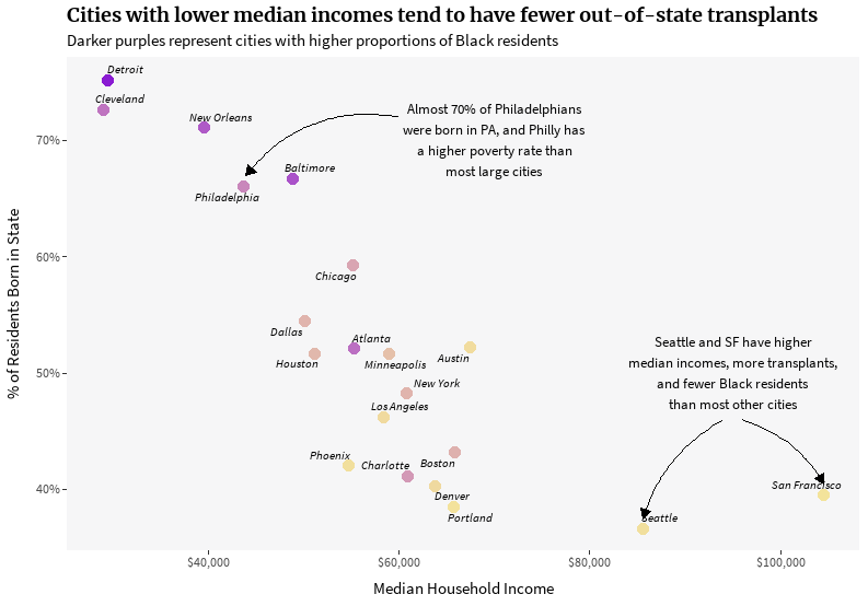
In general, there appears to be a negative relationship between income and the proportion of a city’s residents who are originally from the state. That makes sense if you consider how expensive moving can be. People with less wealth might not be able to afford to move to a different city. Alternatively, less geographic mobility might partially explain lower incomes: given that people often move for economic opportunities (better jobs, higher wages), those who can’t afford to move might miss out on those opportunities.
In the graph above, the cities where most residents were born in-state tend to be cities with higher poverty levels where more of the residents are Black. In one corner of the graph stands cities like Detroit, Cleveland, New Orleans, Baltimore, and Philly – all cities with larger Black populations. The opposite corner contains cities like San Francisco, Seattle, Portland, and Denver. These differences suggest that Black Americans, who have much less wealth than white Americans on average, might have less geographic mobility; in essence, Black people might not be able to move for economic opportunity as easily as white people.
Focusing on Philadelphia, I wanted to zoom in a bit to see if these trends held at a finer spatial scale.
Show code
birthplace <- get_acs(geography = 'tract',
                      table = 'B05002',
                      county = 'Philadelphia',
                      state = 'PA',
                      year = 2019,
                      geometry = T) %>%
  group_by(GEOID) %>%
  summarise(Pennsylvania = estimate[variable == 'B05002_003']/estimate[variable == 'B05002_001'],
            South = estimate[variable == 'B05002_007']/estimate[variable == 'B05002_001'],
            Northeast = estimate[variable == 'B05002_005']/estimate[variable == 'B05002_001'],
            West = estimate[variable == 'B05002_008']/estimate[variable == 'B05002_001'],
            Midwest = estimate[variable == 'B05002_006']/estimate[variable == 'B05002_001'],
            `Outside 50 states` = sum(estimate[variable %in% c('B05002_009', 'B05002_013')])/estimate[variable == 'B05002_001'])

born_pa <- birthplace %>%
  st_drop_geometry() %>%
  select(GEOID, Pennsylvania) %>%
  left_join(get_acs(geography = 'tract',
                    variables = c('B19013_001', 'B02001_003', 'B02001_001'),
                    county = 'Philadelphia',
                    state = 'PA',
                    year = 2019) %>%
              group_by(GEOID) %>%
              summarise(p_black = estimate[variable == 'B02001_003']/estimate[variable == 'B02001_001'],
                        med_income = estimate[variable == 'B19013_001']),
            by = 'GEOID')

born_pa %>%
  ggplot(aes(x = med_income, y = Pennsylvania, color = p_black)) +
  geom_point(size = 3.5, alpha = 0.5) +
  scale_y_continuous(labels = scales::percent_format(accuracy = 1)) +
  scale_x_continuous(labels = scales::dollar, limits = c(20000, 147000)) +
  labs(title = "In Philly, there isn't a clear relationship between income and transplants at the\ncensus tract level; however, tracts where more residents are Black tend to have\nlower median incomes and fewer transplants",
       subtitle = 'Darker purples represent census tracts with higher proportions of Black residents',
       x = 'Median Household Income',
       y = '% of Residents Born in PA') +
  font_theme +
  theme(panel.grid = element_blank(),
        legend.position = 'none',
        panel.background = element_rect(fill = '#F6F6F7'),
        axis.title.y = element_text(margin = margin(t = 0, r = 10, b = 0, l = 0)),
        axis.title.x = element_text(margin = margin(t = 10, r = 0, b = 0, l = 0))) +
  scale_color_gradient(low = '#F3E39B', high = '#8A1BD2')
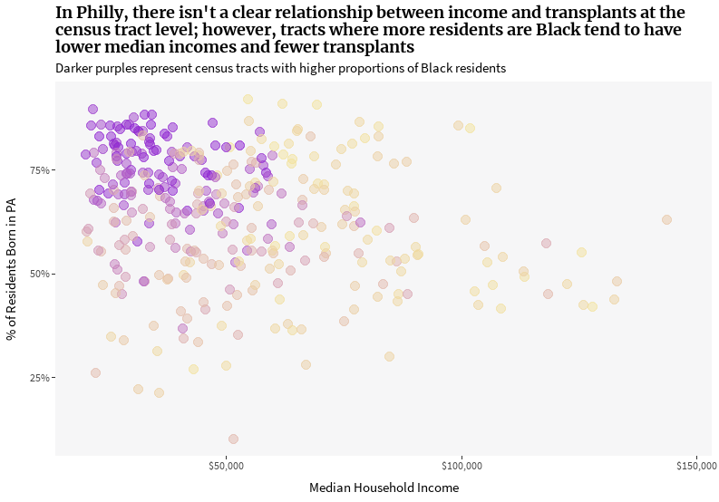
At the census tract level, there isn’t quite as strong of a trend between income and transplants as we see at the city level. But, tracts with a high proportion of Black residents (the purple dots on the graph above) are clustered in the upper left corner, representing areas with low median income and where most residents were born in Pennsylvania. Philly’s high proportion of native Pennsylvanians is even more impressive given that New Jersey is just across the Delaware River.
About 66% of Philadelphians were born in Pennsylvania. That made me curious: where are the remaining 34% from? The map below shows the most common non-Pennsylvania birthplace per census tract.
Show code
# Get most common non-PA birthplace per census tract
common_birthplace <- birthplace %>%
  st_drop_geometry() %>%
  pivot_longer(-GEOID, names_to = 'region', values_to = 'p') %>%
  filter(region != 'Pennsylvania') %>%
  group_by(GEOID) %>%
  slice_max(order_by = p) %>%
  ungroup()


race_points <- st_read('../../../philly_analyses/race_ethnicity/race_points.shp') %>%
  mutate(race_eth = if_else(race_eth %in% c('Native American', 'Native Hawaiian or Pacific Islander',
                                            'Two or more races', 'Other'),
                            'Other',
                            as.character(race_eth)))

city <- st_read('http://data.phl.opendata.arcgis.com/datasets/063f5f85ef17468ebfebc1d2498b7daf_0.geojson') %>%
  st_union()


# Use colors that are similar to UVA's map
my_cols <- c('#ff0202', '#aad44b', '#edb12c', '#e2c46e', '#86bbe3')

map_theme <- theme(
  panel.background = element_blank(),
  panel.grid = element_blank(),
  axis.text = element_blank(),
  axis.title = element_blank(),
  axis.ticks = element_blank(),
  legend.position = 'none'
)

legend_text_race <- tibble(
  labels = c('Asian', 'Black', 'Latinx', 'Other', 'White'),
  lat = c(39.96, 39.95, 39.94, 39.93, 39.92),
  lng = rep(-75.09, 5)
) %>%
  st_as_sf(coords = c('lng', 'lat'), crs = st_crs(city))

legend_text_place <- tibble(
  labels = c('Outside 50 states', 'Southern US', 'Northeast US', 'Midwest US'),
  lat = c(39.96, 39.95, 39.94, 39.93),
  lng = rep(-75.06, 4)
) %>%
  st_as_sf(coords = c('lng', 'lat'), crs = st_crs(city))

# side-by-side map: left, most common birthplace outside PA. right, racial dot map
birthplaces_to_plot <- birthplace %>%
  left_join(common_birthplace, by = 'GEOID') %>%
  filter(! is.na(region))


left_map <- ggplot() +
  geom_sf(data = birthplaces_to_plot, aes(fill = region), col = 'white', size = 1) +
  geom_sf_text(data = legend_text_place, aes(label = labels, color = labels), fontface = 'italic') +
  labs(title = 'Most Common Birthplace\nOutside Pennsylvania') +
  font_theme +
  map_theme +
  theme(plot.title = element_text(hjust = 0.5))

right_map <- ggplot() +
  geom_sf(data = city, fill = NA, col = NA) +
  geom_sf(data = race_points, aes(col = race_eth), shape = '.') +
  geom_sf_text(data = legend_text_race, aes(label = labels, color = labels), fontface = 'italic') +
  scale_color_manual(values = my_cols) +
  labs(title = 'Race and Ethnicity of Residents',
       subtitle = 'Each point represents 10 people',
       col = 'Race/Ethnicity') +
  font_theme +
  map_theme +
  theme(plot.title = element_text(hjust = 0.5),
        plot.subtitle = element_text(hjust = 0.5),
        legend.position = 'none')

left_map + right_map

Keep in mind that this map represents a minority of Philadelphians. Only 34% of residents are originally from outside Pennsylvania, and in many census tracts, that number is much smaller. In the map on the right, each point represents 10 residents. Both maps above reflect the segregated nature of housing in Philly, like many other US cities (especially Northern cities).
To highlight some of the similarities between the two maps, the slider map below shows census tracts where a majority of residents are Black and tracts where the most frequent non-Pennsylvania birthplace is in the South. If you click the white circle and slide left or right, you’ll be able to compare the two maps.
Show code
race_eth <- get_race_ethnicity()

majority_black_south <- birthplace %>%
  left_join(common_birthplace, by = 'GEOID') %>%
  left_join(race_eth %>%
              select(GEOID, race_eth, p_race = p),
            by = 'GEOID') %>%
  group_by(GEOID) %>%
  summarise(is_majority_black = any(p_race[race_eth == 'Black'] >= 0.5),
            is_south = any(region == 'South'),
            is_majority_black = ifelse(is.na(is_majority_black), FALSE, is_majority_black),
            is_south = ifelse(is.na(is_south), FALSE, is_south))


left_pal <- colorFactor(c('#949494', '#a2d5c6'), majority_black_south$is_majority_black)
right_pal <- colorFactor(c('#949494', '#5c3c92'), majority_black_south$is_south)


majority_black_south %>%
    leaflet() %>%
    addMapPane("left", zIndex = 0) %>%
    addMapPane("right", zIndex = 0) %>%
    addProviderTiles(providers$Stamen.TonerLite, group="base", layerId = "baseid",
                     options = c(pathOptions(pane = "right"), providerTileOptions(opacity = 0.2))) %>%
    addProviderTiles(providers$Stamen.TonerLite, group="carto", layerId = "cartoid",
                     options = c(pathOptions(pane = "left"), providerTileOptions(opacity = 0.2))) %>%
    addPolygons(fillColor = ~left_pal(is_majority_black),
                fillOpacity = 0.8, weight = 1, color = 'white',
                group = 'left_group', options = pathOptions(pane = 'left')) %>%
    addPolygons(fillColor = ~right_pal(is_south),
                fillOpacity = 0.8, weight = 1, color = 'white',
                group = 'right_group', options = pathOptions(pane = 'right')) %>%
    addLabelOnlyMarkers(lng = -75.39, lat = 40.03, label = htmltools::HTML('Majority of<br>residents are Black'),
                        options = pathOptions(pane = 'left'), group = 'left_group',
                        labelOptions = labelOptions(noHide = T, direction = 'top', textOnly = T,
                                                    style = list(
                                                      "color" = "#a2d5c6",
                                                      "font-family" = "arial",
                                                      "text-align" = "center",
                                                      "font-weight" = "bold",
                                                      "background" = "rgba(255,255,255,1)",
                                                      "box-shadow" = "3px 3px rgba(0,0,0,0.25)",
                                                      "font-size" = "20px",
                                                      "border-color" = "rgba(0,0,0,0.5)"
                                                    ))) %>%
    addLabelOnlyMarkers(lng = -74.88, lat = 40.03, label = htmltools::HTML('High % of residents<br>born in South'),
                        options = pathOptions(pane = 'right'), group = 'right_group',
                        labelOptions = labelOptions(noHide = T, direction = 'top', textOnly = T,
                                                    style = list(
                                                      "color" = "#5c3c92",
                                                      "font-family" = "arial",
                                                      "text-align" = "center",
                                                      "font-weight" = "bold",
                                                      "background" = "rgba(255,255,255,1)",
                                                      "box-shadow" = "3px 3px rgba(0,0,0,0.25)",
                                                      "font-size" = "20px",
                                                      "border-color" = "rgba(0,0,0,0.5)"
                                                    ))) %>%
    addLabelOnlyMarkers(lng = -75.137, lat = 39.80, label = 'Drag the slider to compare the two maps',
                        options = pathOptions(pane = 'right'), group = 'right_group',
                        labelOptions = labelOptions(noHide = T, direction = 'top', textOnly = T,
                                                    style = list(
                                                      "color" = "black",
                                                      "font-family" = "arial",
                                                      "text-align" = "center",
                                                      "background" = "rgba(255,255,255,1)",
                                                      "font-size" = "11px",
                                                      "border-color" = "rgba(0,0,0,0.5)"
                                                    ))) %>%
    # addControl(title, position = "topleft", className="map-title") %>%
    addSidebyside(layerId = "sidecontrols",
                  rightId = "baseid",
                  leftId = "cartoid")
While many of the graphs we looked at earlier showed less geographic mobility for Black residents, that wasn’t always the case. In the early to mid-20th Century, the Great Migration saw millions of Black Southerners moving north to escape racial terror of the Jim Crow South and to seek economic opportunity. While the purple map above (High % of residents born in South) shows “High %” in relative terms, as most Philly residents were born in PA, those migration trends might be reflective of 20th Century movements.
The relative rarity of transplants in Philly creates a unique culture. It seems like everyone has history and roots in the city or region. However, many Philadelphians might be missing out on economic opportunities in other places because they don’t have the means to move. So, what would an ideal trend look like? Personally, I’d like to see a city where new residents and lifelong Philadelphians alike have the resources to thrive.